On this page
Color modes and management for accurate printing results
Are you looking for accurate printing results? The use of color models and profiles can make all the difference. From RGB to CMYK and Pantone, there is a wide range of options available to meet your printing needs. In this blog post, we will explore the differences between these various models and how to choose the right one for your project. We’ll also look at how to create a color palette for easy color management and how to make adjustments so that your print results are perfect every time.
What color model is used in printed designs?
When it comes to printing, color modes and profiles are essential elements for achieving accurate results. Knowing the differences between RGB, CMYK, and Pantone is key to creating a successful project.
-
RGB (Red, Green and Blue) is an additive color model used in digital media such as websites or video games. In this model, the colors are created by adding red, green and blue light together at different intensities. The resulting colors are vibrant and vivid but not suitable for print due to the lack of ink coverage.
-
CMYK (Cyan, Magenta, Yellow and Black) is a subtractive color model used in printing. In this model, the colors are created by subtracting cyan, magenta and yellow from white light using black ink. This method produces more muted tones than RGB but it can be accurately reproduced on paper or other materials with the right combination of inks.
-
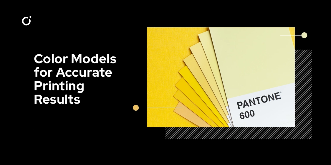
Pantone is an international standardized color system used mainly for professional printing. It features over 1,000 pre-mixed solid colors that can be easily identified by their code number so that they can be accurately reproduced across different mediums such as print or web design projects without any discrepancies in hue or saturation level.
Color profiles work to ensure accurate color reproduction when transferring data between devices with different color outputs like computer screens or printers. They provide instructions on how to translate a given set of colors into another format so that they appear properly on each device regardless of its capabilities or limitations.
ICC (International Color Consortium) profiles are widely accepted industry standards used for calibrating devices such as monitors and printers for accurate results when printing images or documents containing text or graphics in multiple formats like PDFs or JPGs.
If you are working with various types of projects it’s important to understand the differences between print and digital media since they require different approaches when it comes to managing color accuracy across multiple mediums.
For example, web designs require RGB while printed designs might call for CMYK or Pantone depending on your specific requirements. And what do you do when you need to convert them?
Using RGB, CMYK, and Pantone color modes for print
When it comes to printing, the choice of color mode is paramount for achieving accurate results.
-
RGB (Red, Green, and Blue) is a light-based color mode mostly used for digital media such as websites or computer monitors. So in order to obtain good results in print projects, it should be converted into CMYK.
-
CMYK (Cyan, Magenta, Yellow, and Key/Black) works by using ink on paper, producing colors that can be accurately reproduced when printed. However, some tones may not be achievable due to the limited number of combinations available.
-
The Pantone Matching System (PMS), also known as Pantone Color Library, provides a universal language of color that designers around the world use in their work. It consists of an ink library with over 1,000 shades which can produce exact hues that cannot be achieved with either RGB or CMYK models. The downside is the higher cost associated with this system due to its specialized nature.
To ensure precise printing outcomes every time you need to create your own custom palette using one of these modes and then convert it into another if needed - like from RGB into CMYK - via specialized software like Adobe Photoshop or Adobe Illustrator; you can even make small adjustments manually if desired!
Product specifications (color models for digital printing, sewing, engraving custom designs)
Sometimes selecting the right color model may depend on the project at hand - whether it's digital printing, embroidery, engraving custom designs or others. Let's look at some of the popular choices:
For two-dimensional projects such as digital prints, RGB (Red-Green-Blue) is often the preferred choice due to its ability to produce a wide range of vibrant colors.
However, for textile and 3D prints CMYK (Cyan-Magenta-Yellow-Black) should be used since it works with percentages rather than absolute values like RGB does.
Additionally, Pantone Color Matching System (PMS) can be employed when exact colors are necessary - such as for logos and branding materials - as it assigns unique numbers to all 1,100 swatches in Pantone's library.
In order to ensure better color management throughout the production process, creating a palette can be highly beneficial. This allows users to store reference points and make quick changes if any adjustments need to be made during the course of creating their design. Furthermore, many programs provide post-production editing tools that allow subtle color alterations such as hue shifting and lightning/darkening features so that you can achieve perfect results every time!
Creating a color palette for easy color management
Creating a color palette for easy color management is essential for any graphic designer or printer. A well-thought-out palette can save time and ensure accuracy when transferring data between devices. It can also eliminate the need for multiple rounds of proofing, which can be especially helpful in professional printing projects.
The first step in creating a color palette is to select the colors that you want to use. This could include standard CMYK hues, Pantone swatches, or even custom colors created using a graphics editing program. Once you have your colors selected, organize them into groups based on how they will be used in the project such as backgrounds, accents, shadows etc. This will make it easier to find the right hue quickly and accurately when needed.
Once your colors are organized into groups it’s important to test them to ensure accuracy before they are sent off for printing services. To do this you should print out test swatches and compare them against the original digital file on your computer screen or tablet device. If there are any discrepancies then make adjustments accordingly until everything matches up perfectly – if necessary use post-production editing tools to make accurate adjustments for perfect print results.
Finally, once all of your colors match correctly it’s a good idea to store them in an easily shareable format such as an Adobe Swatch Exchange (ASE) file so that others can access them quickly without having to recreate them from scratch each time they are needed. Additionally, certain software tools like Adobe Creative Suite allow users to create their own custom palettes with ease which makes working with large numbers of colors much more manageable and efficient over time.
Making adjustments for perfect print results
Achieving the desired outcome from any project requires some adjustments for perfect print results. Knowing how to use color profiling and adjusting the color spaces, as well as understanding the differences between raster and vector images, can all help you attain great results when printing.
When selecting a color space, make sure it is capable of accurately reproducing colors when printed. RGB is normally used for digital prints while CMYK works better with textile and 3D prints. For an exact match of colors, Pantone’s Color Matching System is the go-to choice in such cases. Apart from this, also consider bleed, trim, and safe areas during the design phase since any misalignment can affect how your design looks post-printing.
Check that your chosen color profile is compatible with the printer you are using beforehand as well; a test print will let you know if there’s any discrepancy between what you envisioned during the design process and how it looks after being printed. Post-production editing tools are available to make necessary changes before printing so that you get consistent results every time.
Finally, create a color palette in an easily shareable format like an Adobe Swatch Exchange (ASE) file so that quick access is always available without wasting time searching multiple files or recreating each time. Following these steps allows for successful adjustments for perfect print results!